Simplifying a
complex incident platform
I joined the team through Harness' acquisition of Transposit, a technically robust but deeply engineered incident management platform. Years of feature growth had created a powerful system, but one that was hard to learn, configure, and use day to day.
I led a full UX overhaul, integrating the product into Harness while transforming its complexity into an intuitive, adoption-ready experience.
Problem
Platform Admins, typically cloud engineers, are responsible for configuring incident types, integrations, runbooks, and automation to ensure teams are incident-ready.
In the inherited system, these tasks required excessive manual setup and multi-step configuration, turning onboarding into a slow, time-consuming process.
This surfaced our guiding question:
How might we reduce setup friction for our platform admins?
Competitor Analysis
Transposit’s closest competitors were Incident.io, FireHydrant, Rootly, and Blameless. Although feature parity was strong, the UX was less intuitive and harder to onboard.
I trialled each platform, analyzed their onboarding flows, and documented what worked well. These insights informed a simpler, more self-serve experience.

Comparing onboarding flows and user experience.
I also partnered closely with our beta customers, internal dogfooding teams, and product team to streamline these workflows and remove unnecessary friction.
Design
Mapper Interactions
A key part of platform setup is integrating external systems — such as monitoring tools and ticketing platforms like Jira — so AI SRE can ingest logs, signals, alerts, and incident data.
Because this requires extensive mapping — defining how fields in external systems correspond to variables in AI SRE (for example, how a Jira “severity” or “title” maps into our model) — I designed simple, intuitive visual interfaces that make these relationships easy to configure, validate, and maintain.
The result is a more transparent mapping experience that reduces setup friction while ensuring reliable data flows into AI SRE.


Visual mapping tools designed to make field relationships quick, easy to understand, and validate at a glance.
Automation
Another important part of setup is defining what should automatically happen when an incident occurs — for example, creating a Jira ticket, opening a Slack channel, or triggering remediation steps. We support this through Runbooks.
In designing this, I was influenced by my time as a workflow automation consultant at Workato, where users built automations in a similar visual, node-based way. I brought that mental model into AI SRE by creating a runbook canvas — a visual workspace that makes automation logic explicit so platform admins can clearly understand cause and effect before anything runs.


I also designed how execution results should be displayed, ensuring the experience feels transparent and trustworthy end to end.


Runbook execution designs.
Builders
Platform admins also need to create forms and templates, but Transposit lacked usable builders, making setup slow and error-prone.
To address this, I designed a new suite of form and template builders capable of supporting complex use cases with many variables and conditional logic.
Highlights include side-by-side previews, allowing admins to see in real time how their configurations would appear and behave before publishing them. Drag-and-drop reordering and clearer structure further improved control and confidence during configuration.
I’ve written a more detailed reflection on the design challenges and learnings from this work — you can read it here.

Form builder for creating an incident form.


Template builder for creating status update templates.
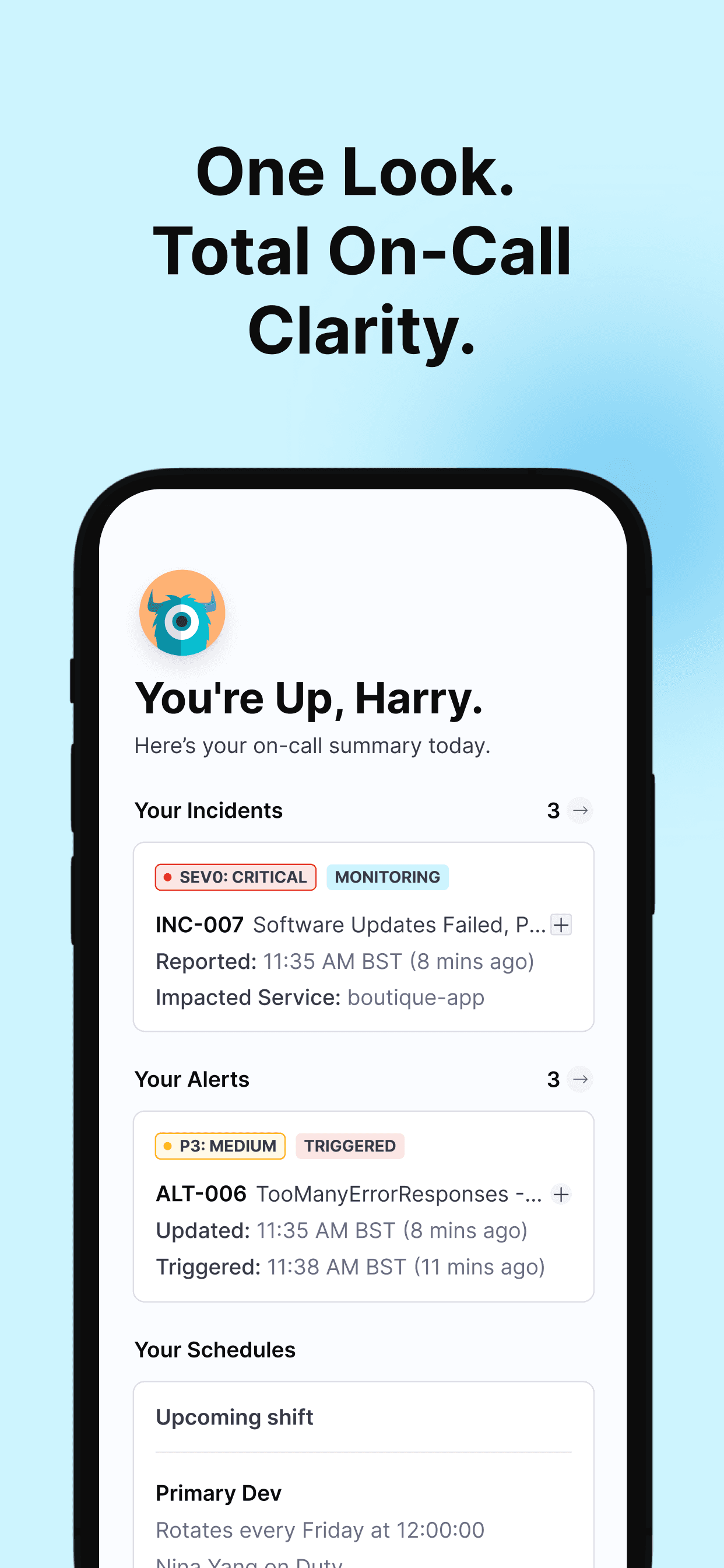
Visualisations
I explored visual patterns to help teams quickly understand incidents and changes. This included a Kanban style incident board for fast categorization and triage, a time based change timeline to surface and correlate recent changes with active issues, and a response readiness view to show how prepared teams were to act.
These views improved situational awareness by making key information immediately scannable and easier to act on.


On-Call
To support a customer migrating off PagerDuty, I designed the on-call experience for both web and mobile for AI SRE. This marked my first return to mobile design in three years, and you can read more about my approach here.
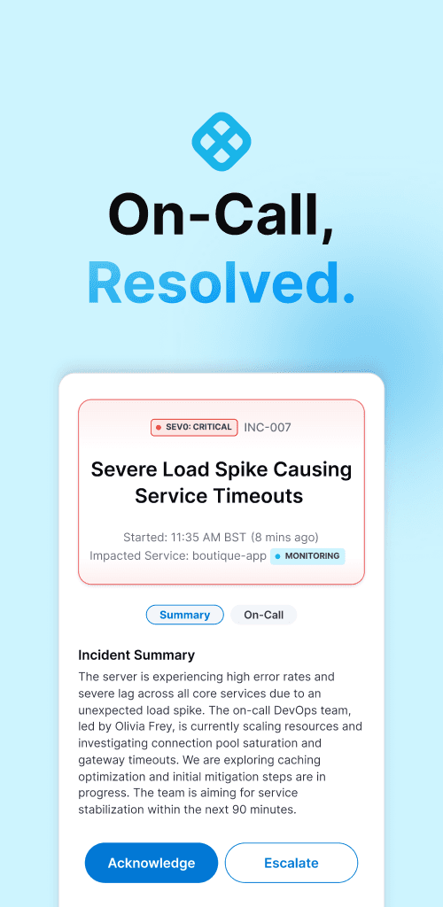

On web, I designed the on-call calendar and scheduling experience, creating clear visualizations and working closely with our dogfooding team to prioritize the highest-impact views first.


On-call experience for web.
Defining Edit Patterns
Harness generally uses a draft-and-publish model for saving changes, inherited from its CD pipeline workflows where edits are high-stakes and deliberate. While this pattern made sense for integrations and runbooks, it didn’t fit the fast, lightweight updates needed during active incidents.
For incident, alert, and change details, edits are frequent and low risk. Hence, I designed an inline edit and save experience inspired by Jira tickets, allowing responders to update information instantly without breaking their flow.
Jira-style inline editing with automatic saving of intermediate changes.
Integration Challenges
As Transposit was integrated into Harness, many inherited components didn’t fit cleanly within the new design system or interaction patterns. I worked to reconcile these gaps, refining the experience so it felt cohesive end to end. The on-call scheduling rotation, for example, was redesigned from a clunky pattern into a clearer, more intuitive interface.
Results
636
hours saved
99%
↓ in onboarding time
160X
faster than before
Previously, onboarding required two engineers working closely with customers for nearly two months (~640 hours). With the redesigned experience, Tebra, our first beta customer, was able to self-onboard with only four hours of support — a ~99% reduction in setup time.
Marketing & Docs
I also created diagrams, flows, and supporting visuals used across documentation, demos, and PM assets to ensure consistency between the product, website, and customer-facing materials.

Diagram I created for documentation and pitch decks.
Final Thoughts
This project reinforced my belief that great UX isn’t about adding features, but removing friction. By simplifying complexity and aligning the experience end to end, we turned a powerful system into one teams could actually adopt and rely on.
